Hope you all have had a great start to the New Year. The last few weeks have been so stressful beyond I can describe. This has to be my first E V E R major project. If you remember back in late October I shared with you my thoughts and ideas on the Burlington Arcade and Loboutin store design.
So I thought I would share with you all today part of this project and my tips on how to render CAD drawings in Photoshop.
The shop space that we were working on was N.Peal (far left of the drawing).

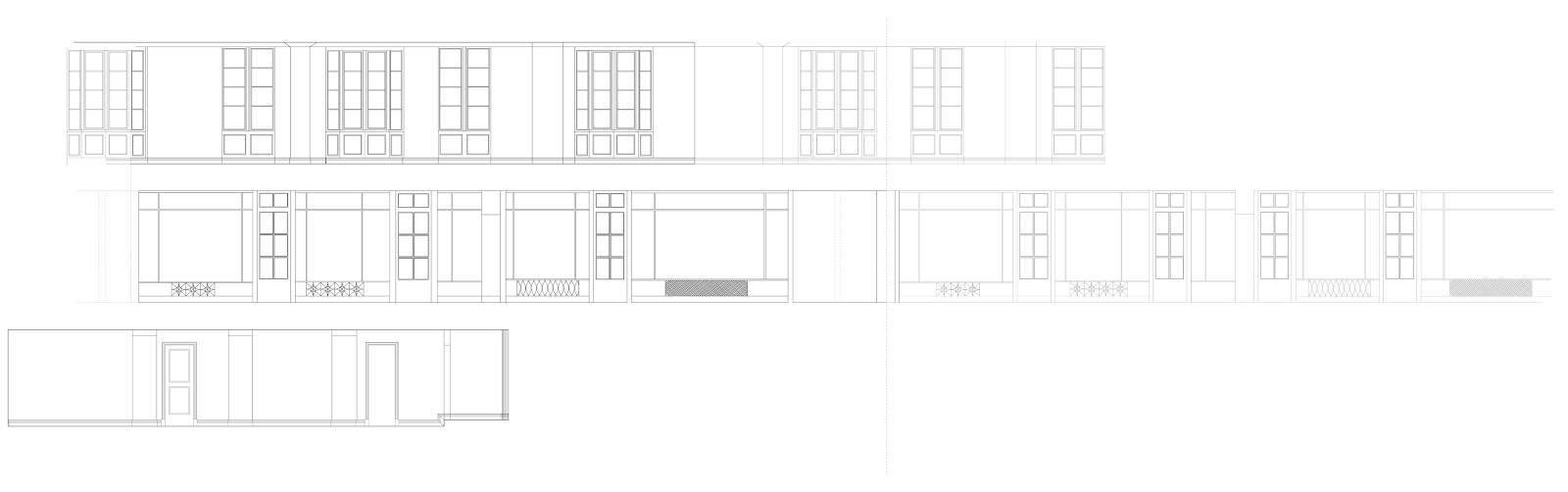

Okay, so lets start with the basics. All elevations were drawn using AutoCAD. Create different layers for each section (exterior, interior, windows, doors, skirting boards etc) and adjust each layers line weight. You don't want to draw the whole drawing using the same line weight through out as it wont be realistic. Drawing the image in different line weights emphasises the structure and allows it to show a better interpretation of the area you are using to draw.
Once you have completed your drawings, scale them to the required size and export them to a PDF file. They are now ready to be taken into Photoshop for the rendering process.

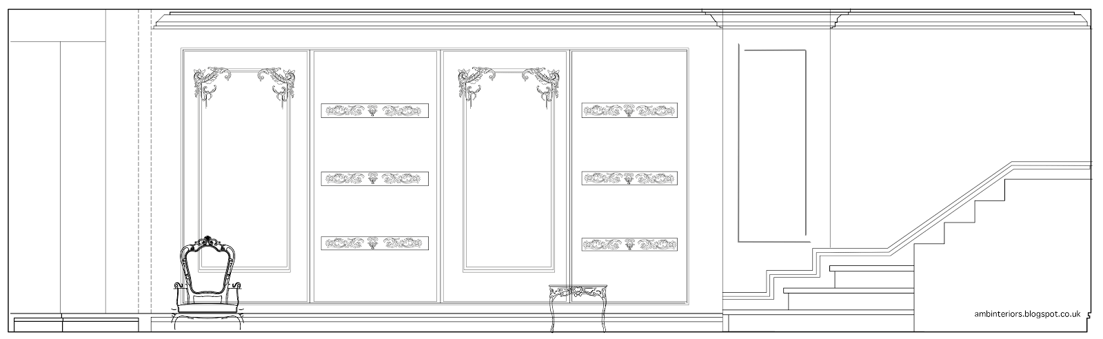
When working on Photoshop, again you want to be working with layers. So for each section of the image you want to render, create a layer for it. Don't forget to rename each layer so you can easily keep track of it. (Believe me, you are going to want to do that. I had roughly around 25 layers just for one drawing!)
The tools that I used for the rendering process where the pollygonal losso tool, rectangular marquee tool, (these were used to crop out areas that weren't needed or to trim around tight curves and lines), The gradient and paint bucket tool (the gradient tool was used to help achieve a realistic mirror effect) and lastly to give my furniture and walls more depth I played around with the 'blending options'. This allows you to add effects to your images and will help in making them appear more realistic. The effects that I used were bevel and emboss, drop shadow and for furniture I would use the satin effect as well. I would say to just play around with the effects, change up the opacity until you are happy with the outcome.

For the curved detail on the shelves and mirror, I simply found an image online and imported it in to Illustrator and used the 'curvature tool' to trace over it. When doing this my tip is to change the opacity of the image to a lesser percentage so you are able to see the line you are drawing. Another tip is to lock the image you are using so it doesn't move out of place whilst tracing over it.
This project took so much out of me but on the way I was able to pick up and learn new things. The next project is all about hotel design, which is going to be an even bigger project. Hopefully I won't be biting off more than I can chew ahaha. Bring on the new term!
Side note. I would hate to bring negativity to my blog but unfortunately a few weeks back an incident of plagiarism happened. It has left me really wary of posting any sketches on my blog. I will however post up the sketches at the end of the academic year just to avoid work being used for the same projects etc.
Post a Comment